The average website user spends less than 20 seconds on a web page before moving on. In such a short amount of time, it’s important to make a good impression and give users the information they need to stay on your page and keep scrolling.
This is where “above the fold” comes in.
“Above the fold” is the ultimate prime real estate in web design, and for good reason – it’s the part of the page that users see first. If you can make sure that your most important information is above the fold, you’ll be doing yourself a huge favor in terms of usability, user engagement, and ultimately increasing your conversion rates.
So what can you do to make sure that your most important content is seen by your website visitors? In this blog post, we’ll go over what should and shouldn’t be above the fold, as well as provide some best practices to help you maximize above-the-fold design to help capture and keep a visitor’s attention.

What Does “Above the Fold” Mean?
“Above the fold” is a phrase that originated in the newspaper industry in the early 1700s, and it refers to the area of a newspaper or magazine that was visible when folded for display on a newsstand. The idea was that the most eye-catching, important content would go there because, if you didn’t catch someone’s attention with what was on the front page, they might not bother to flip through and see what else your publication had to offer.
These days, “above the fold” has taken on a new meaning with regard to web design. Now, it’s more about making sure that the most important content on your page is visible without having to scroll down. And for many businesses, that means making sure certain types of content are visible above the fold line of your web pages or displayed on only the top half before users scroll.
What Should be Above The Fold?
Now that we’ve established the importance of above-the-fold content, let’s take a look at what should be included in your above-the-fold design:
Your CTA
This is one of the most important pieces of information on your page, so make sure your CTA is visible without the user having to scroll.
Your value proposition
Why should users stay on your page? What are you offering them? You need to make sure that this information is clear and easy to find.
Your product or service
What are you selling? This is what your users are coming to your site for, so make sure it’s prominently featured.
Unique selling proposition
What makes you different from your competition? If you can communicate this quickly and effectively, you’ll be one step ahead.
Contact information
If users have questions or want to get in touch, make sure they can easily find your contact information.
What Shouldn’t Be Above The Fold?
Now that we’ve gone over what should be above the fold, let’s take a look at what shouldn’t:
Too much text
You want to make sure that your content is easy to scan and digest. If you have too much text, users will likely get overwhelmed and click away.
Too many images
Images are great, but you don’t want to have so many above the fold that your web page looks cluttered. A good rule of thumb is to use images sparingly and make sure they add to the overall experience.
Flashy animations
Again, you want to make sure that your content is easy to consume. If users are bombarded with too many flashy animations, they’re likely to click away in frustration.
The takeaway here is that less is more. You want to make sure that your above-the-fold content is clear, concise, and easy to understand.

Best Practices for Above-the-Fold Content
Now that we’ve gone over what should and shouldn’t be above the fold, let’s take a look at some best practices to help you make the most of this valuable space.
1. Keep it simple
The above-the-fold content on your page should be easy to understand and digest. That means no lengthy paragraphs of text or complicated images. Stick to the basics and make sure your meaning is clear.
2. Make it scannable
Users should be able to scan your content and quickly understand what it’s about. To do this, use short paragraphs, bullet points, and headlines.
3. Use eye-catching headlines
Your headlines are your chance to make a good first impression, so make them count. Use strong verbs and interesting adjectives to capture users’ attention, and make sure your headlines are large enough to be seen from a distance.
4. Place key content front and center
If you want users to take action, make sure it’s easy for them to do so. Put your call-to-action buttons or links in a prominent location above the fold, and make sure they’re big enough to be easily clicked on.
5. Utilize strong visual elements
Images and videos can be extremely effective at grabbing users’ attention, so use them wisely. Make sure they’re relevant to your content and place them prominently above the fold. If you use them effectively, they can be a powerful tool for above-the-fold content.
6. Use whitespace wisely
Don’t cram too much information into a small space – leave some breathing room above the fold so that users have time to digest it all. This also helps keep your layout simple and uncluttered.
7. Test, test, test
The only way to know for sure what works best for your page is to test different options and see what resonates with your users. Try different layouts, images, and CTAs and see what gets the best results.
8. Keep it fresh
Just like the rest of your website, your above-the-fold content should be kept up-to-date. That means regularly refreshing your visuals and making sure your message is relevant.
9. Pay attention to the details
The small details matter just as much as the big picture when it comes to above-the-fold content. Make sure your headlines are clear, your images are high quality, and your call to action is easy to spot.
10. Use responsive design
Responsive Web Design is an approach to web design that makes web pages render well on a variety of devices and screen sizes. A responsive website adapts the layout to the viewing environment, by using fluid grids, flexible images, and media queries.
Just like it’s important to have responsive web pages that look good on all devices and screen sizes to ensure you aren’t losing traffic, your above-the-fold content should be optimized for mobile devices as well.
11. Use simple navigation
Last but not least, your navigation should be simple and easy to understand. That means no drop-down menus or complicated links. Stick to the basics and make sure your users can easily find their way around.
By following these best practices, you can make sure that your above-the-fold content is effective and will engage your website visitor’s attention.

An Example of “Above the Fold” Design
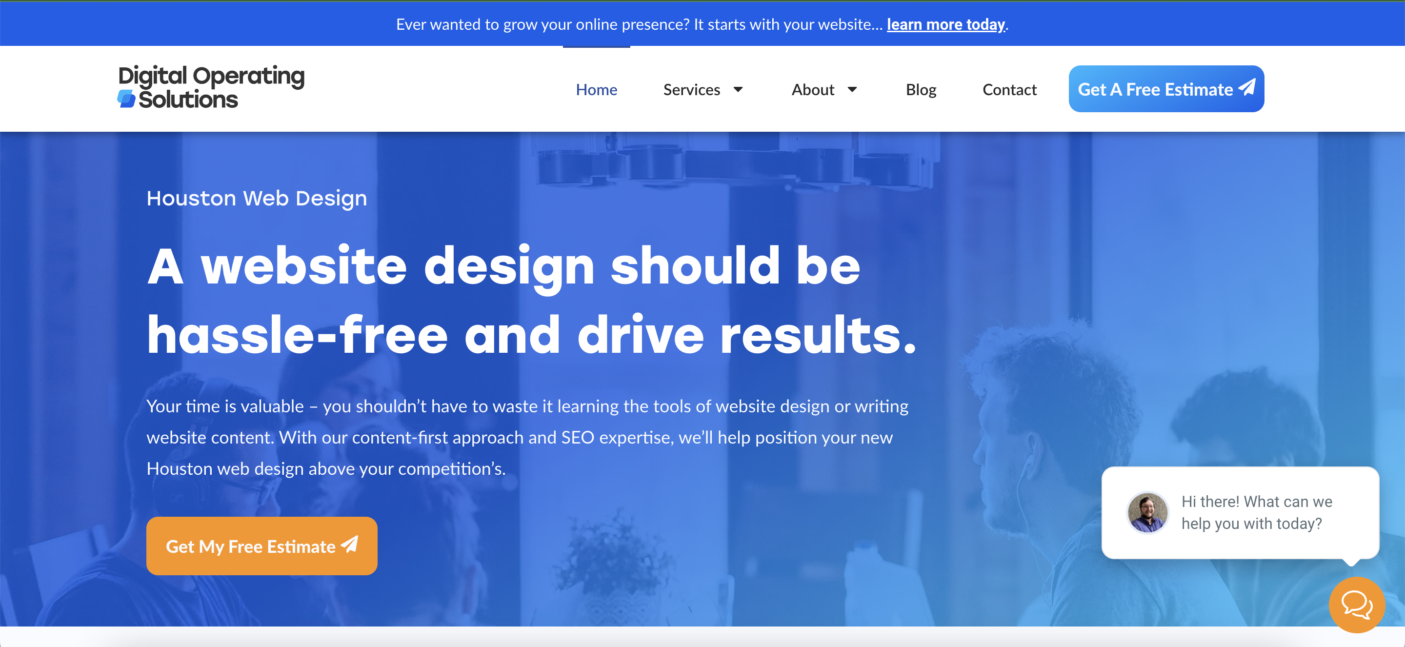
For our website, we wanted to make sure that our above-the-fold content was clear and concise. We communicated the problem we solve for our clients in our heading, as well as value propositions like “SEO expertise” and “content-first approach.” We placed our call-to-action buttons in a prominent location, using contrasting orange colors to our brand colors to help them stand out. We also utilized whitespace and a non-distracting but relevant background image to keep our layout clean and uncluttered.
Overall, we’re happy with how our above-the-fold content turned out. It’s clear, concise, and easy to understand, and it effectively communicates our message.
What do you think? How have you designed your own above-the-fold content? Share your thoughts and tips in the comments below!
Final Thoughts
Above-the-fold content is one of the most important aspects of web design. It’s what users see first and it can make or break their experience on your site.
That’s why it’s so important to get it right. By following the tips in this post, you can make sure that your “above the fold” content is clear, concise, and effective. It’s only a matter of time until you’re pulling in qualified leads!
Do you have any questions about “above-the-fold” content? Let us know in the comments below.
Frequently Asked Questions
Does “above the fold” content affect SEO?
Yes, above the fold content is important for SEO. The section of a web page that is visible without scrolling is known as “above the fold” and is considered the most important part of a page for SEO. That’s because it’s the first thing users see when they visit your page, so it’s essential to make sure it’s optimized for search engines.
By including relevant keywords and phrases and by making sure your content is high-quality and informative, you can improve your ranking in search results pages and attract more visitors to your site.
For more information on how to optimize your homepage for SEO, check out our blog.
What goes below the fold on a website?
The “fold” is the point on a web page where users need to scroll down to see more content. Anything that appears below this point is considered “below the fold.” While above-the-fold content is considered the most important part of a page, below-the-fold content can also be effective in engaging users, building trust, and ultimately converting them into customers.
Some common elements that can be included below the fold are:
• Additional information about the company or product
• Images or videos
• Testimonials
• Social media icons
• Portfolio Information
• Certifications, awards, and brand associations
• Location Information
• Contact Information
What size is above the fold in web design?
According to recent studies, the fold is typically around 600 pixels in height. However, this varies depending on the size and resolution of the user’s screen. As a general rule, it’s important to make sure that your most important content is within the first 600 pixels of your page. That way, it will be visible no matter what device or screen resolution the user is using.


